

I designed the parts so that the text and illustration can be detached and used separately.
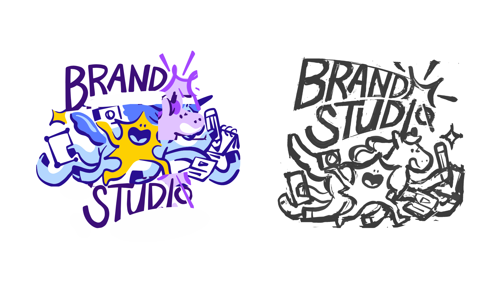
The “I” in the word studio is a wand, but it also doubles as the unicorn’s horn when the two are put together because our team’s superpowers are sparking ideas and sprinkling moments of delight!
Our initial brainstorm and drafts. Building out this board was a team effort! From here, Christi (my fellow illustrator) and I conceptualized our own takes.
Below are my sketches.
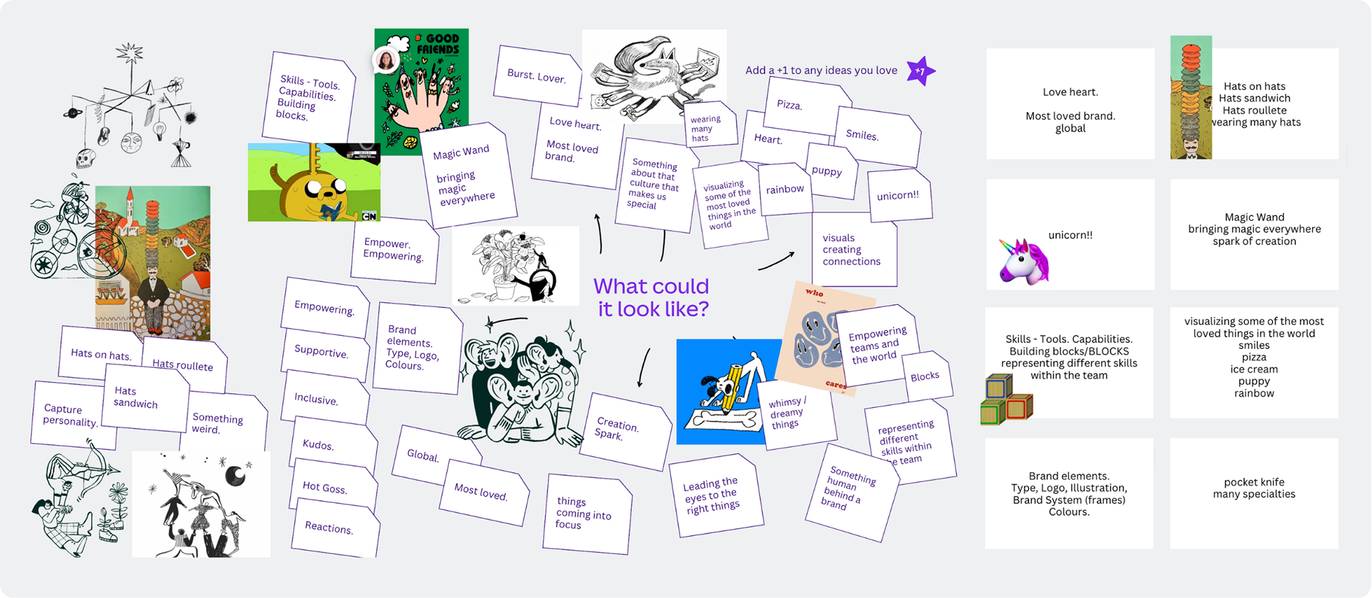

Initial character studies that became part of the logo.

Had an idea to incorporate the unicorn horn as a wand where the spark is coming from as I explored further.
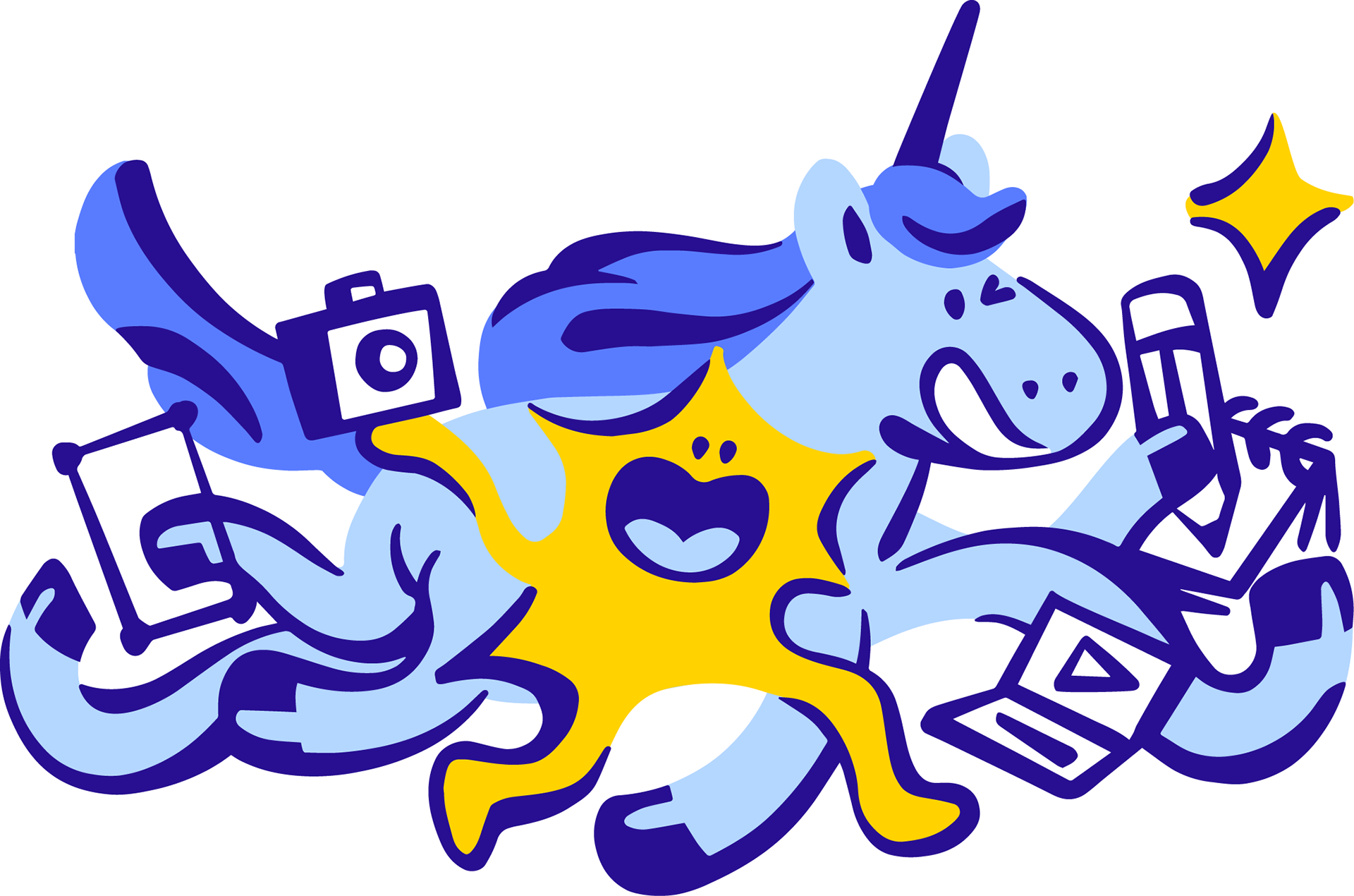
The logo evolved. Our team wanted an even crazier concept: give the unicorn more legs to show off our diverse specialties and a little spark friend. This pass was drawn by my teammate. In the end, the team wanted to use the unicorn with the rounder face alongside the wordmark I sketched.

I was tasked to finesse the logo. On the left was me Frankensteining the logo with the feedback in mind. I then sketched it again to get a clearer idea. Redrew, colored, and packaged the files after which we created extra materials and a limited edition team hoodie!
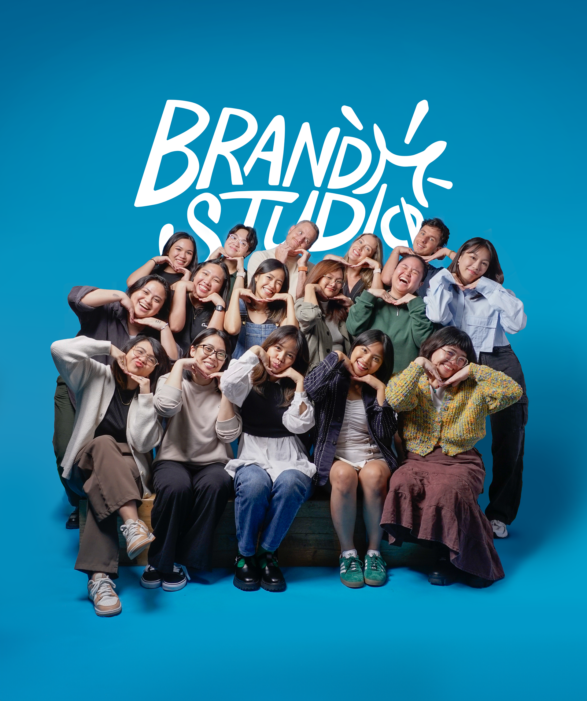

A designer put together a simple poster using the wordmark. On the left is the hoodie we designed for the rest of the team.
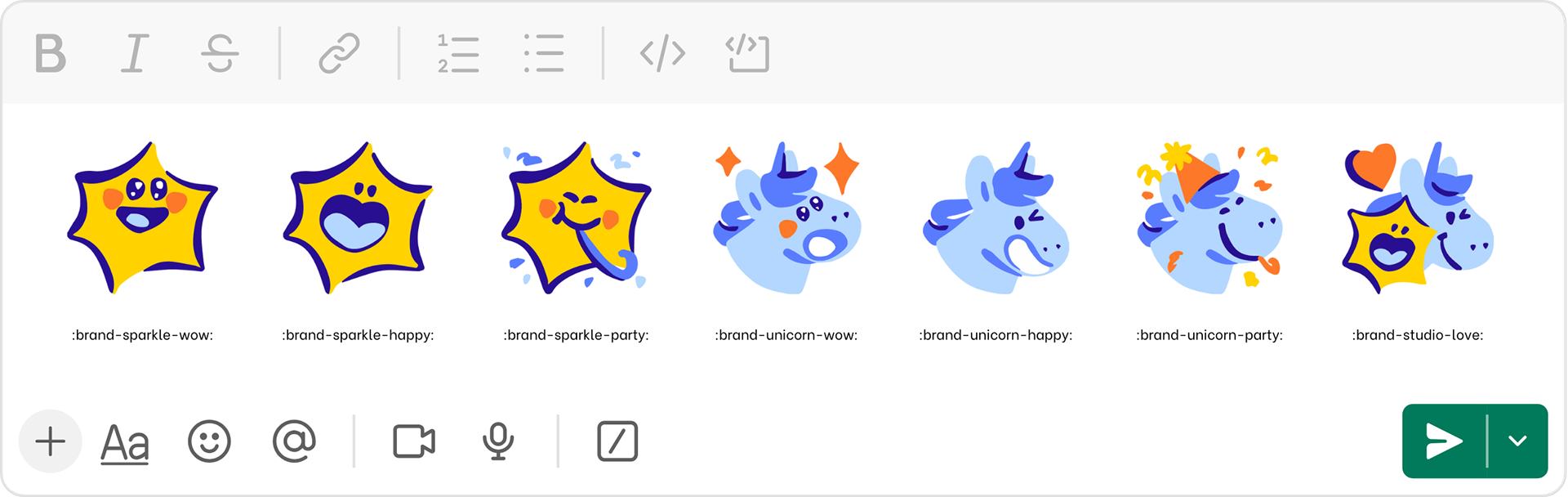
Also illustrated our team's slack emojis for fun!