
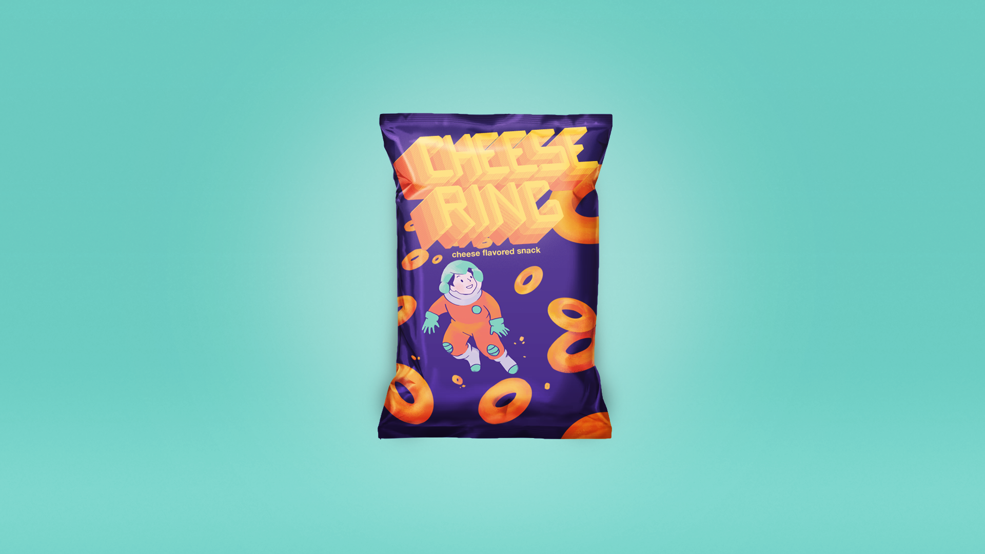
The refreshed package.
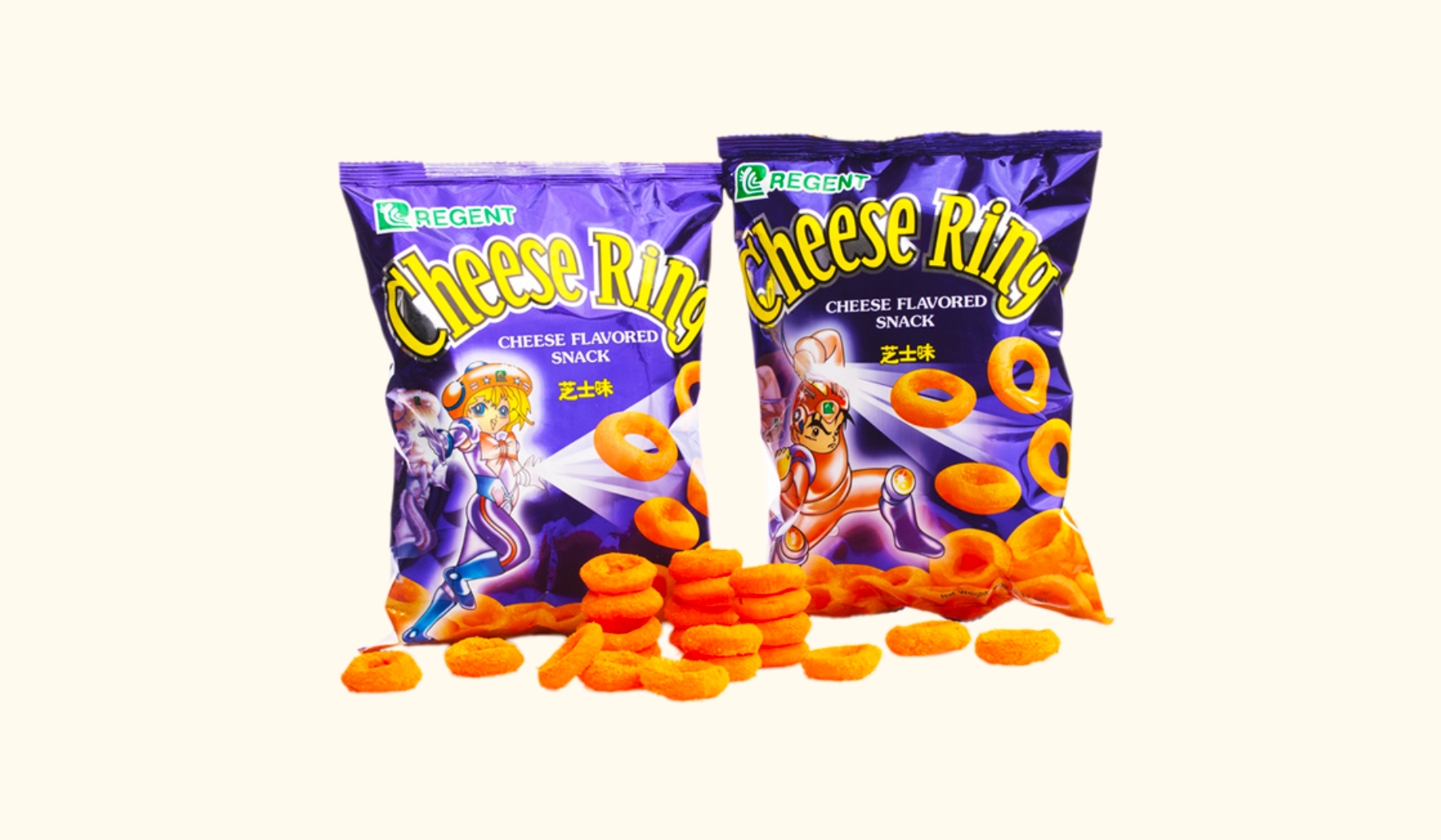
This is the old snack packaging I got inspiration from. I did not want to change too much because of the sentimental attachment Filipinos have to the snack, so I kept the original's essence: the character and the floating cheese rings.
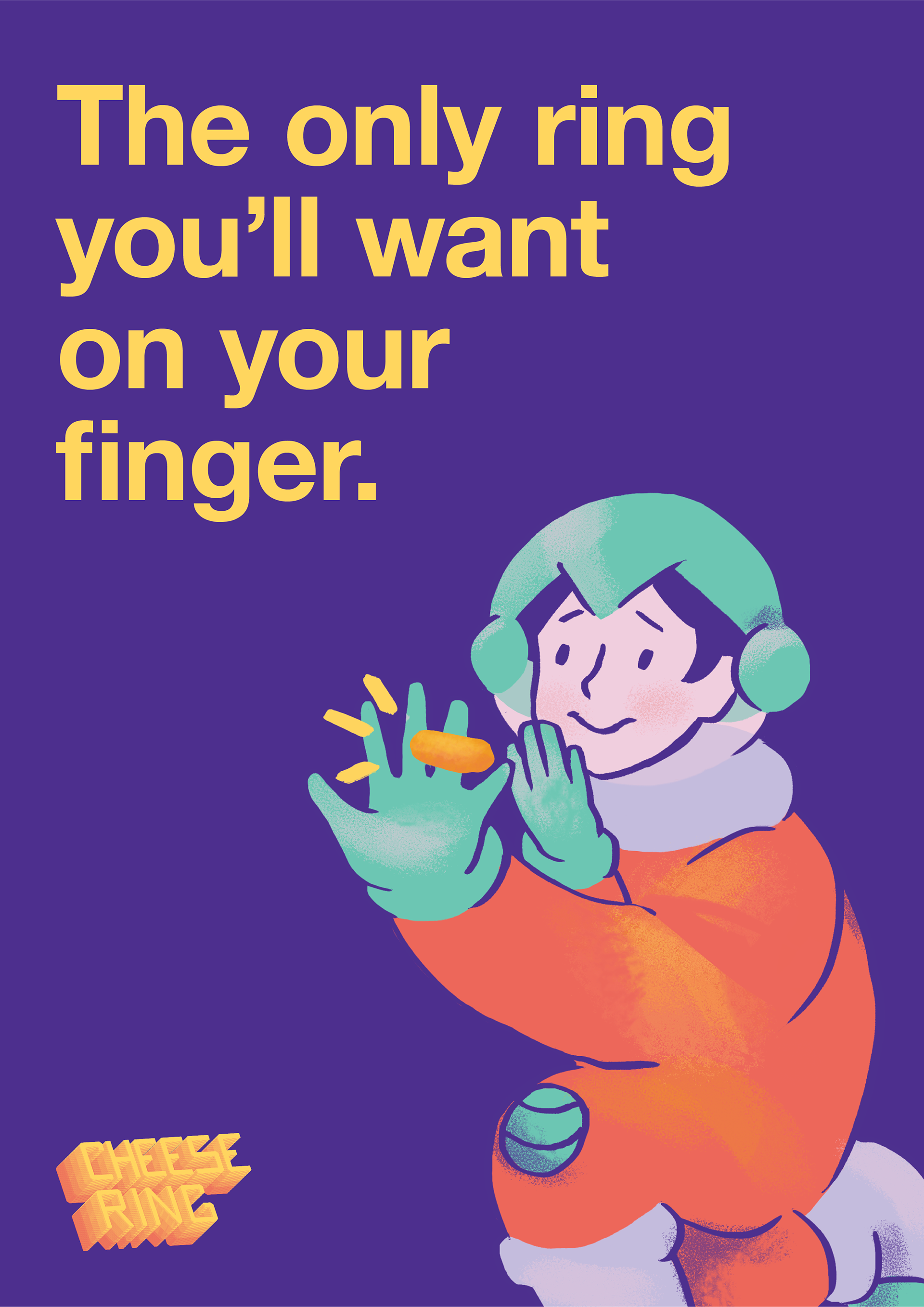
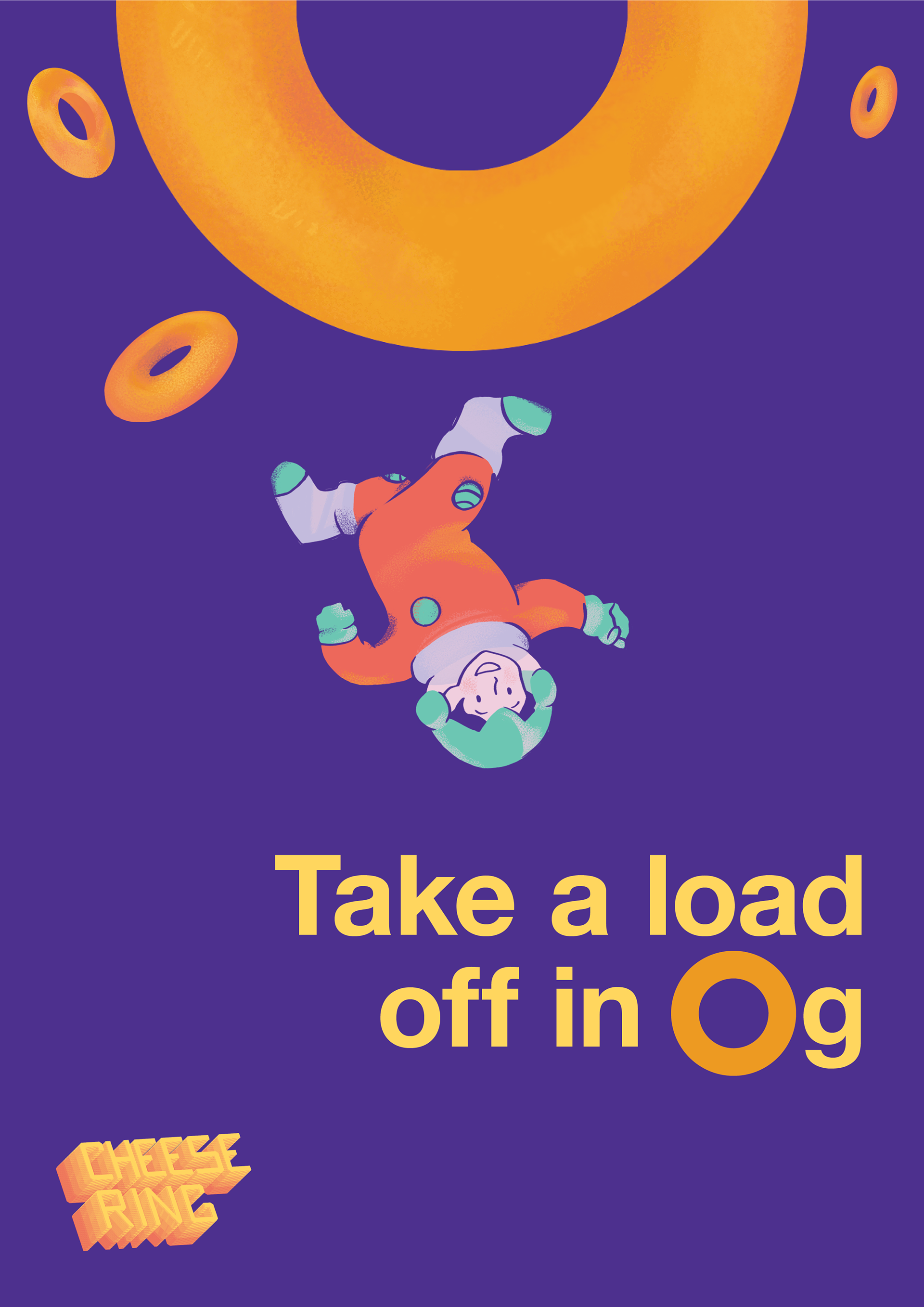
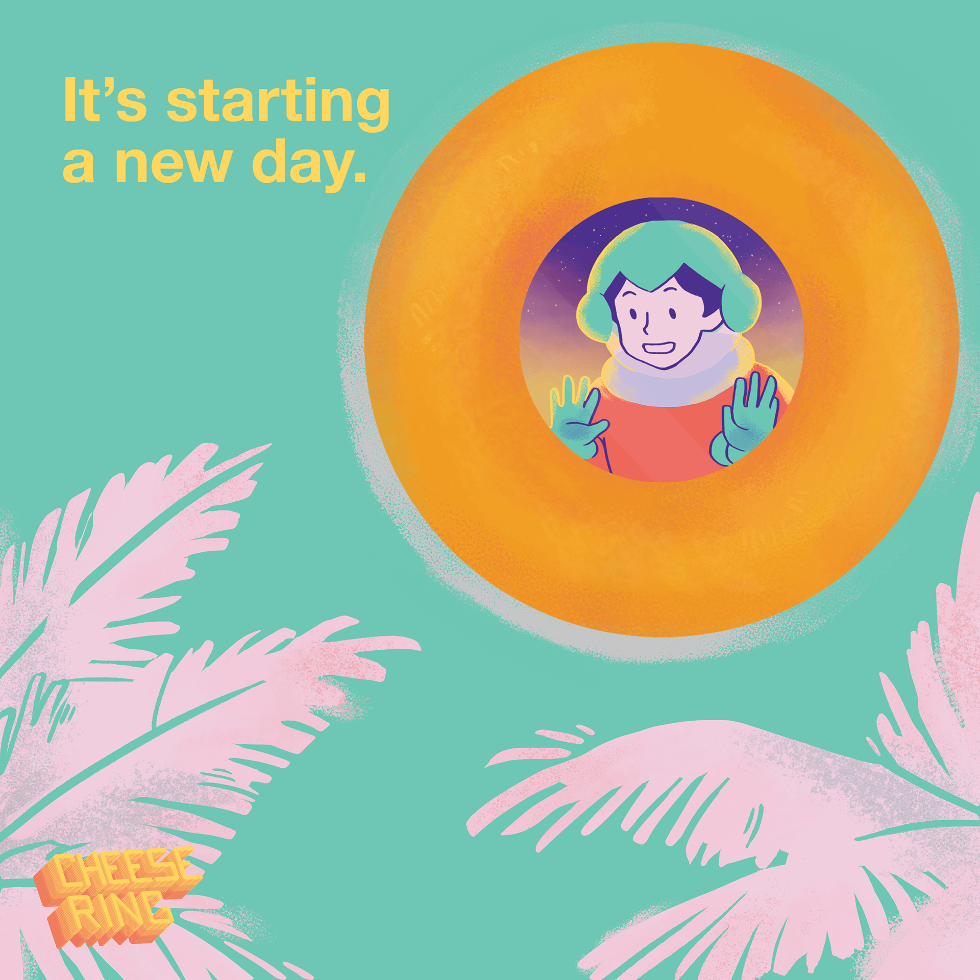
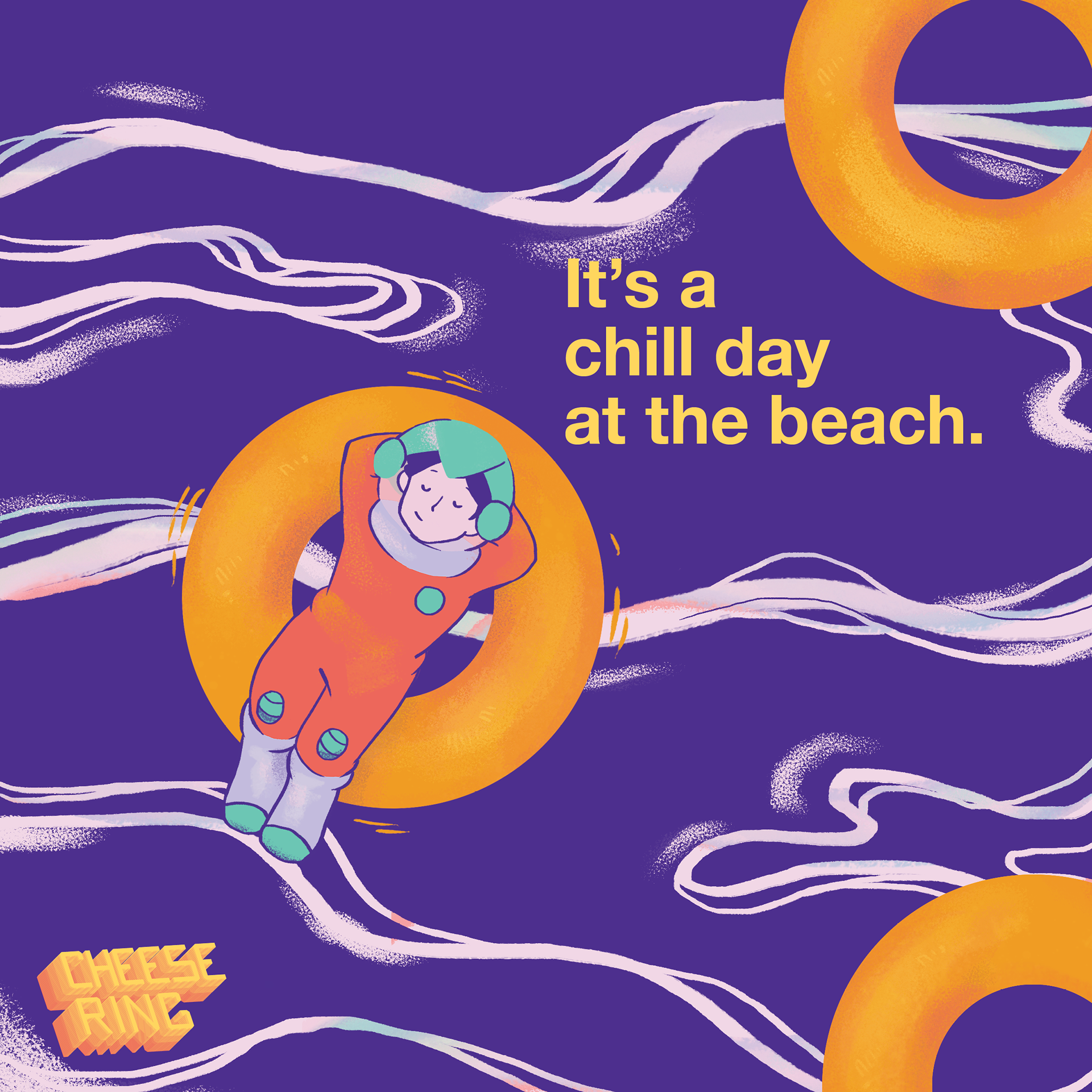
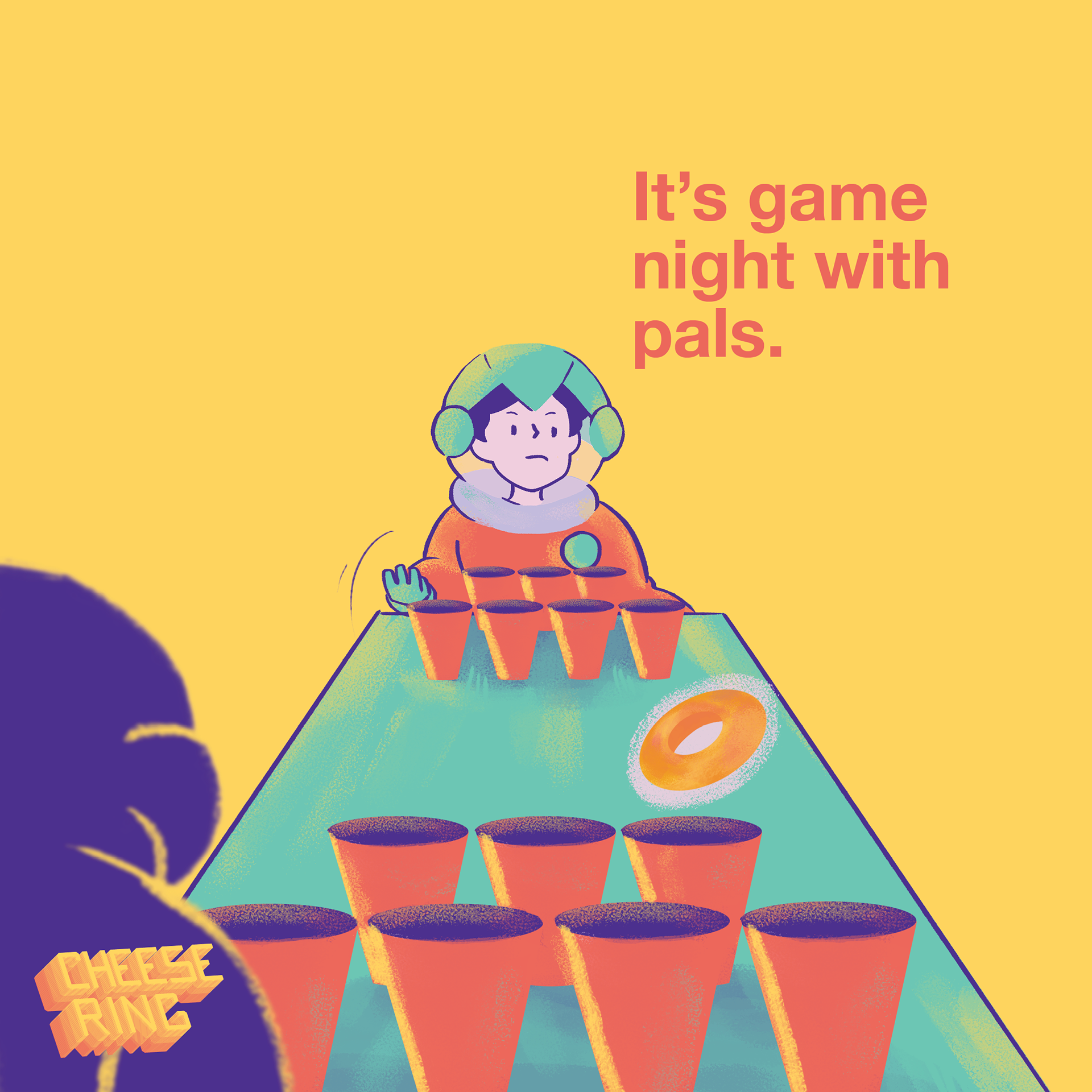
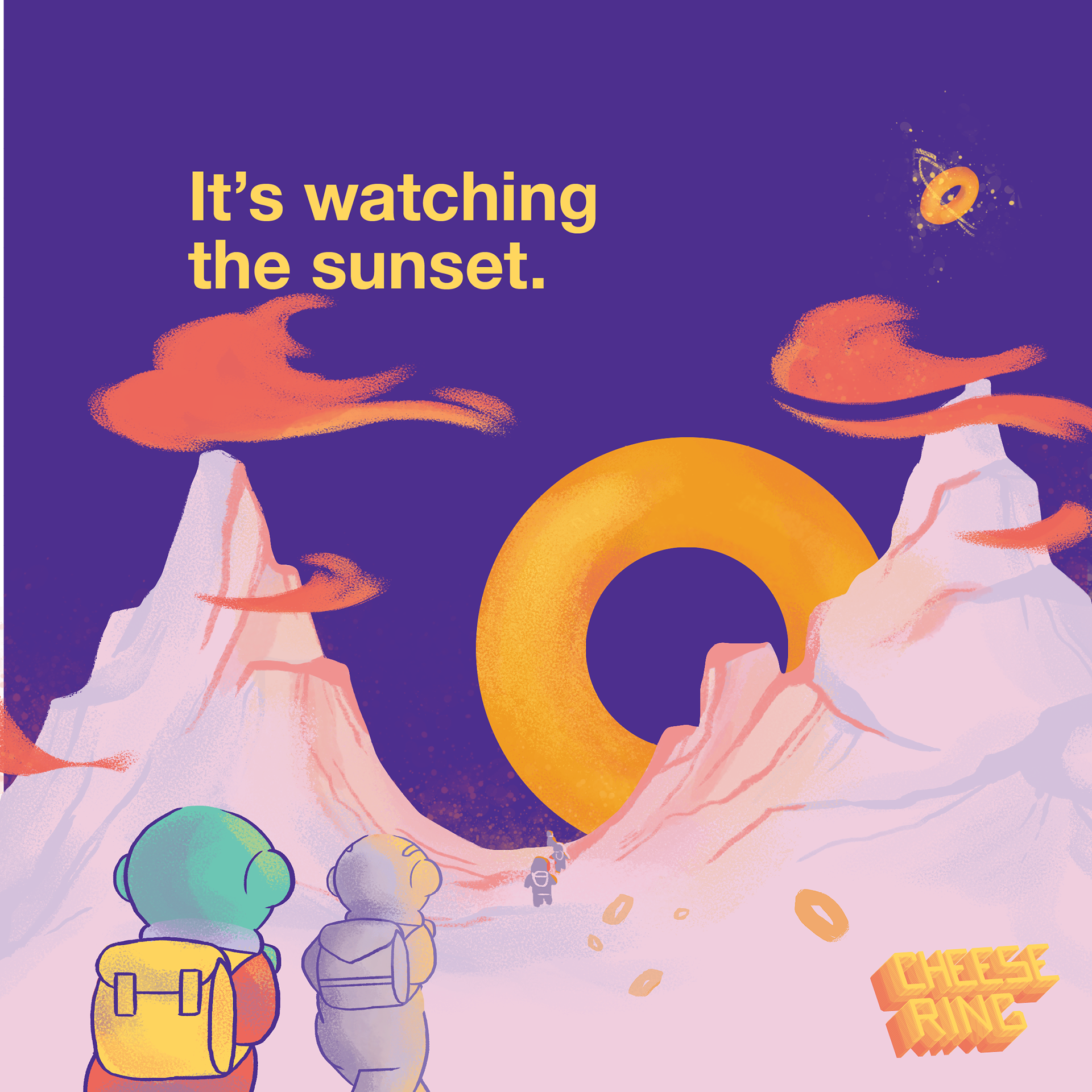
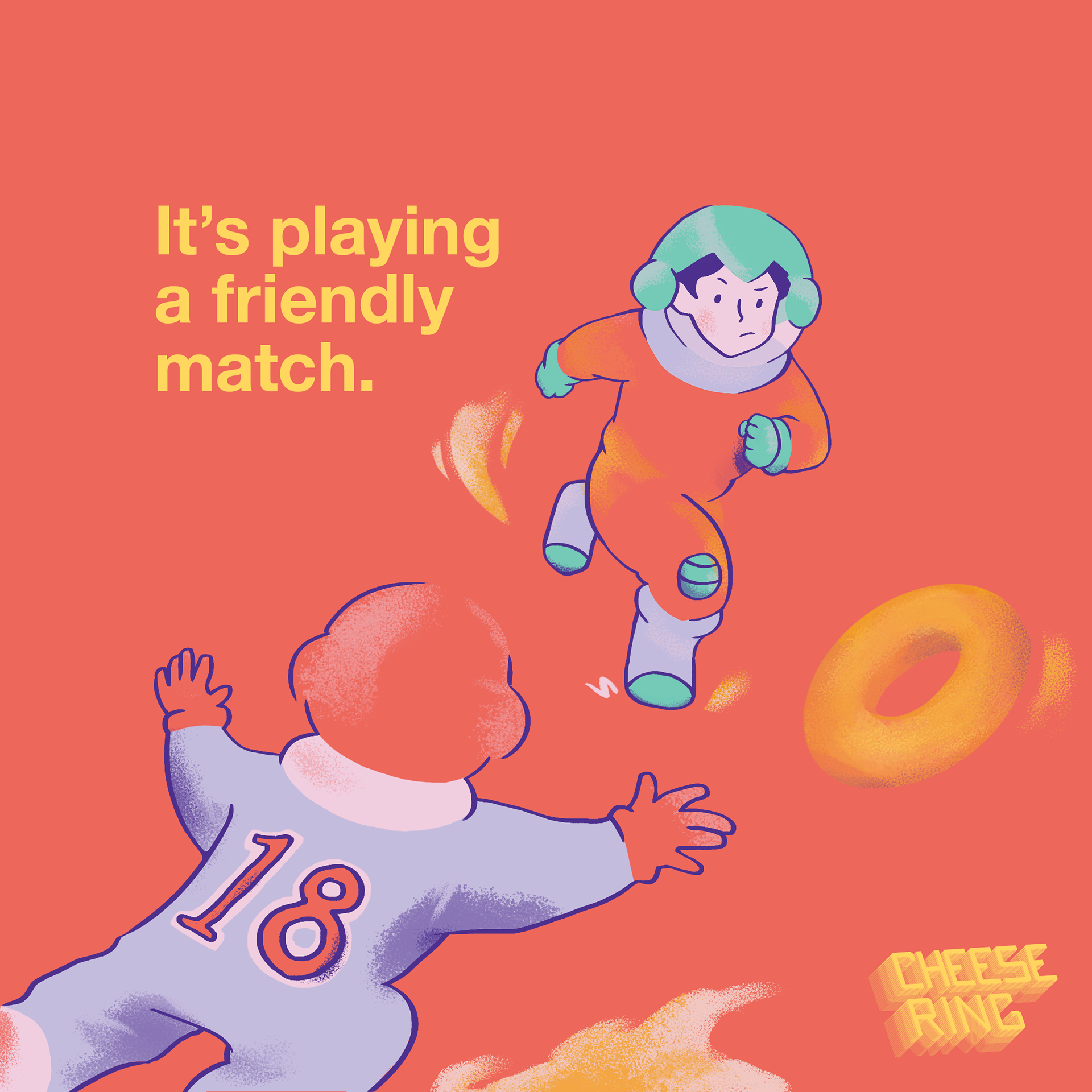
The refreshed logo is reminiscent of retro space graphics, while the visuals and copy were created based on the research I did on people's perception on the snack. For people, Cheese Ring is anti-boredom, a travel staple, and a childhood snack that gives them comfort. I used the ring and the space character as my key visuals, putting them both in fun and playful scenarios as if to say the snack is your bestie through many life experiences!